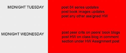
Let's switch gears and critique the 84 Blogs. There are some great things happening there!
(Do that by commenting on this post with a list of crits for everyone.)
I am very pleased with the quality of these crits so far! Excellent work!
We will begin to work on layout soon, so do some sketches!
Hope you all are well. San Francisco Rules.
Wednesday, June 10, 2009
Subscribe to:
Post Comments (Atom)
Are we critiqing the 84 blogs as well as the book project blogs too or only the 84 blogs this time?
ReplyDeleteDanielle
I'm quite sure it’s the 84 series that we critique for this week. In the blog Valerie posted the following comments, "let's switch gears and critique the 84 Blogs". And we do that in this blog post with a list of critiques for each person. Basically make a list 1 through 18 and write a crit for each person w/ their name.
ReplyDeleteI think the last day of class she said that regardless every week we'd have to critique the book series, unless I'm mistaken.
ReplyDeleteAlex- Your blog is very well put together. I enjoy having to scroll across the page in order to see the entire photograph. My favorite so far is the photo of the rice. What kind of camera do you use to get such clear shots?
ReplyDeleteBrittany- Just a thought, but it might be fun to actually go around and look for people or objects that are naturally out of place or unusual instead of setting up your photos. The ones with the people in them are really working for me! Very creative!
Christine- While you do have some strong pictures, some seem to be a little blurry. I'm not sure if that is intentional? I would continue taking more outdoor shots. Those are my favorites so far!
Crystal- Loving the captions! Those are definitely working for me. I would strongly suggest adding yourself in more of the photos. I think it works better with your artist statement.
Danielle- Gorgeous photos! You have a great eye! My favorite so far is the photograph of the water bottle- creative! I really couldn't find anything that I would change!
Elaine- You have some very nice photos here, however, when I think of ceilings, I think BIG! I would suggest maybe making your photos much larger.
Gina- The captions under the photos are appreciated. I would love to see more close up shots of the signs, and maybe try using more creative angles. I think that would make some of the photos more appealing! Love this idea though!
Ian- I'm not sure that much has changed since the last time we critiqued your blog. Your photoshop skills are great, can't wait to see more images!
Josh- You have such a great eye! Your photos are very strong and definitely speak to me. Keep it up!
Juleah- You have become more and more doll like with each set of photos. They keep getting better! Did you decide to not add anymore text to your blog?
Kyla- I smile every time I look at your blog!:) Maybe work on getting a few close-up shots. I'm having trouble actually seeing any zits on your face. I do like that you are in the bathroom for each photo, will that continue?
Lindsey- I would consider changing the title of your blog since your series does not focus on going green, but rather on the color. You have some good shots though!
Melissa- Beautiful lighting! I more attracted to the photos where I can actually tell what I'm looking at. Just a suggestion. :)
Nick- You took pictures of the names of the cars, not the design. Try taking pictures of the lines on a car to add movement to your photos. :)
Sarah- Everything is working well for me! Great artist statement and beautiful photos! Will your sister be placed in anymore of the photographs?
Sky- I love that there is a mystery behind each photo taken! I'm not very familiar with Seurat, but I'll be sure to check him out!
Soung- While these are all very beautiful and appealing photographs, I do wish that you would have shown the shirt completely white, and made that your first photograph.
Caitlin Peacher
ALEX- Your photograph is showned us something detaily, which is out of seeing about what we do not concerned at all. Your shooting skill is really good. I hope to know how to get it as your picture.
ReplyDeleteBRITTANY-I like very fist one. that has an emotion. How don't know how to tell about what i feeling. but it is really good.
CAITLIN-It just shoes. but it has more than that is shoes. It has awesome visual aspect. It can be anywhere. that was good ideas. I Like it.
CHRISTINE- Your photo is really getting better. it just object picture, but it looks like the drawing. it has very artistic visual.
CRYSTAL-make me hunger. i like the third one. Did you twisted picture by pothoshop?
DANIELLE- your idea is really good. my favorit one is the water in laundry. your have very good point of view. but just water at the beach is so usual.
ELAINE- where did you get this picture. In the beach? I hope to see more. I am expecting next one. Each picture has own mood.
GINA- THe trafic sign in the picture was outstanding. the red color is apt with the gloomy backgroud.
IAN- I expect my picture you took before. just kidding. I feel like the fake face was represented as inner personality. so far so good.
JOSH- your blogs is so professional. photograph is too. your appellation of title help me understand your picture more. The title really match your photography.
JULEAH- wow. How to make this blogs. I hope you teach us detaily. you really got a skill to post the blog. Anyway, your face in this picture also so emotional. looking really good. I love it.
KYLA- This is really cool. I am really love it. however, what about the changing the background with the living room or some other place. that will be awesome.
LINDSEY- How to make this blog. i wonder why. this blog is so professional. i love it. You also has good point of view and various angles for photography.
MELISSA- Your picture is really unexpected. that is really cool. Even thought the photo was shaking, it has the center of point.
NICK- it is good. but i recommend you change the angle of view. it will be more awssome.
SARAH- it has diffrent mood on each picture. that is good. if you have any exaggerated movements, it will be better. i guess.
SKY-
this picture was mysterious. it seems to be the drwing picture. every image has nonsence too. it is simillar with the abstract painting.
* ALEX-The burnt sienna series was awesome. I like that they all have a micro/macro look to them. The green seemed tweaked with a bit though.
ReplyDelete* BRITTANY- The chair and potted plant was successful for my interpretation of your statement. The duct tape over the mouth was slightly confusing but I can kind of relate it to the series.
* CAITLIN - Your series started out more sexy and is becoming more journalistic maybe. It made me think about and realize how many different shoes I am exposed to on a daily basis.
* CHRISTINE- Your slow shutter and heavily color saturated pieces are very fun to look at. I like that you are finding things and studying them closely - it has a certain flow to it.
* CRYSTAL - This is starting to develop nicely. I am getting a very clear picture of what you eat. It does make me wonder if you eat vegetables and if you would consider taking photos of maybe some healthy stuff too. I feel dirty looking at all the fast food. Maybe I just gained like 5 pounds doing so.
* DANIELLE - Some photos feel very personal and are presented in a giving way. The foamy ocean photo allowed me to sharply remember the smell and taste of that visual. nice.
* ELAINE - Your ceilings make me think you have an interesting life. The fact that you are going outside with the camera is brilliant.
* GINA- I like the ones with the vibrant colors. For some odd reason I think it would neat to have sound narrate the definitions of the street name meanings.
* IAN- Hope all is well and can’t wait to see more.
* JOSH - Your photos evoke a feeling that is tangable and dark. I found that upon viewing these, I had to turn on radiohead and begin my day with sadness; a pure pleasure.
* JULEAH - The last series is my favorite. It looks as if a larger force has placed you in these positions. Starting to get a little creeped out by your blank stares.
* LINDSEY - The color balance is improving. The subjectmatter is different from the greens I would present and I find that interesting.
* MELISSA - The overstimulation of the lights is beautiful. Nice composition.
* NICK - I think you have the logo thing down. What if you photographed cars after the rain?
* SARAH - The sunset series was nice but a little dark. It might be cool to shoot looking into the sunset. Your colors are warm and vibrant.
* SKY- The humanoid subjects are working for me. The others might be cool to see a little larger.
* SOUNG - The purple/orange with black foot is my favorite. Are you going to do any pics of the dirty/soiled shirt hanging by itself?
ALEX- I really love this series. My only real criticism is the blurry ones distract from the fully focused ones, honestly if you went either direction I believe it would work.
ReplyDeleteBRITTANY-The chair series is excellent and so are the others but I'm not sure they mesh completely together. Keep doing what your doing though I definitely want to see more.
CAITLIN- You have some excellent images on here the ones I think work the best are the ones where the shoes do not seem to fit the action.
CHRISTINE- I can see where you are going with this but I don't know how the evenly lit ones will work with the rest of the idea and I think you should stay away from digitally altering them.
CRYSTAL-This is a very eclectic series I think you have a lot room to make this work well.
DANIELLE- I like how you are breaking down the water I would suggest trying a slow and fast shutter shots of the same water.
ELAINE- I love your interpretation of your idea with trees and umbrellas and all sorts of unusual coverings. This is great!
GINA- I think your use of color and space works very well together.
IAN- This glimpse into the personality has a very voyeuristic appeal.
JOSH- These images give such a strong feeling towards the song titles, this would be a great project to have the music in the background.
JULEAH- I have been following this series closely and every week it gets better, your strongest one is with the polka dot mug.
KYLA- I am amazed by your candidness with this series which makes this so strong.
LINDSEY- the use of the natural green is very strong even the commercial green works with it. The composition is strong so keep it up.
MELISSA- These images are so strong there is nothing to criticize. i would love to see a gallery show of these images and would love about four as prints for my walls.
NICK- The compositions are getting stronger which I feel is needed to pull off this series.
SARAH- This idea is really working. My one critique is did you measure the distances out?It just seems that some might be off (could be my perception through the lens though)
SOUNG-is this all to one shirt or is this to a bunch of different shirts?
* ALEX- I love the new photos! The green ones especially. The details in the photos are very nice. keep up the good work!
ReplyDelete* BRITTANY- I really like the photos with the chair. I'm glad you are doing them in black and white. It works well. I also think it would be interesting to adventure around and find things that are naturally out of place. :)
* CAITLIN-I think you should keep going in the direction of putting certain shoes in situations that you wouldn't normally think they would be in. Flip flops are always seen on the beach so those photos are as interesting. Keep up the good work!
* CHRISTINE-I would like to see a stronger contrast in lighting. If you want us to question the photos, there needs to be stronger lighting to drastically change the picture.
* CRYSTAL-Your photos make me hungry! I really like the one with the cans. Very Warhol-esque. You are doing a great job with this series!
* DANIELLE-I really love the way you are capturing water in so many different ways. My favorite is the condensation on the cup. I find it very beautiful. Keep up the good work!
* ELAINE-Your ceilings are very nice. I kind of like the size of the photos because it challenges our concept of size. We think of ceilings as very large and the photos are small. Keep going!
* GINA-Your series is very intriguing. I love seeing the new photos each week and the definitions for the street signs. It is really working well.
* IAN-I can't wait to see the new photos!
* JOSH-All of your photos are strong and they work well with the song titles.Keep up the good work!
* JULEAH-Your photos are getting stronger! I like how you look tangled and left abandoned. Keep it up!
* KYLA-The photos are great! I think you should turn them into a gif animation in the end so we can see the designs dance across your face!
* LINDSEY-The composition of your photos is great and I like how you use green objects rather than changing the color in photoshop. Keep up the good work!
* MELISSA-The newest photo is so great! And I don't mind if I can't tell exactly what the photo is of, seeing as it is like a painting. Can't wait to see more!
* NICK- Your photos are getting stronger. I would like to see some different angles to make it a little more interesting. Keep it up!
* SKY-Your photos are very strong and I like trying to figure out what's in the photo. The ones with a lot of color work the best.
* SOUNG-Your series is awesome! I can't wait to see the shirt in the end. The composition is great and so are the colors! Keep up the good work!
This comment has been removed by the author.
ReplyDeletealex- you are taking a simple concept and making it very interesting. i love scrolling down and around your page.
ReplyDeletebrittany- i think your idea is taking off. i like how each week has a different series but they all work together.
caitlin- i think you have a balance of strong shots mixed in with some weaker ones. some of them seem a bit random, like the flip flops at the beach. everything's not lost tho, just keep brainstorming for some images that will compliment your artist statement.
christine- your pictures look good, buttttttttt do they go with your artist statement? right now it's probably 50/50, some do and some dont
crystal- i like what you are doing. the only thing i would say may help improve the blog would be to make all of the images the same size.
danielle- your pictures look really good. however, a lot of them look verrrrrrry similar. just look for ways to do something new or different every time.
elaine- your pictures are very cool when viewed in full resolution. if possible, id say make them bigger on your blog.
gina- everything is going great with your blog. you stepped your game up.
ian- i know you havent had a chance to update your series in a while, so i think the last thing i said was "cool stuff" so i guess i still say the same thing.
josh- i think your newest photo is called "i might be wrong." i think that best describes your BLOG. you ARE WRONG! jk im talking to myself.
juleah- you are staying strong and keeping true to your statement and series.
kyla- your series is entertaining to follow
lindsey- i think since you stopped "over color correcting" the photos they have been getting better and better. i think you have a good eye for composition. maybe make your pix bigger on your blog. bigger is BETTER...sometimes
melissa- if it is wrong to choose a favorite blog, then lock me up.....i love what you are dong. in my photo library on my cpu you'll find stuff very similar to what you are doing so that may be why i like your material so much. either way, keep up the good work, its looking great and doing exactly what your artist statement says. i am a bit angry tho, because this was a potential book idea for me haha
nick- keep fighting the good fight. i like your layout.
sarah- nice attention to detail. measuring the distance is really cool. great locations too.
sky- i like pixelation. embrace it. the only thing i feel is missing are colors that POP out. right now they sorta just sit on the page.
soung- the side scroll idea is BRILLIANT. it works great
I'm going to have to post these in two comments because it's saying I'm using too many characters. So here it goes:
ReplyDeleteALEX: I really love your idea for this project. I’m enjoying scrolling through the pictures and looking at the different colors, shades, and the texture of the object being captured. You are definitely staying strong because the focus is on the color because the objects are so blown up and distorted.
BRITTANY: Your series idea is really interesting. I did find a very minor mistake in your statement: “which is may, to many people, seem very foreign and unusual.” I don’t think you need that “is” before “may.” I think the images convey actions and setting that seem strange to the viewer, or at least to me. The most common of the images though, is the yoga/meditation shots since they could be in someone’s front yard (not that I’d be doing that in my front yard, but some people might. Lol!).
CAITLIN: I really like this series idea. I think you have a lot of possibilities, especially with the way you have worded your artist statement. I agree with what most everyone is saying so far. I think your stronger images are the ones where the shoes and actions are out of sync. It’ll be really interesting to see where you go next.
CHRISTINE: I think your images are really visually strong. I like how the lighting is really concentrated in some pictures while in others it is barely there.
CRYSTAL: It is fun to see what you eat next. I agree with Caitlin, I think with your statement the way it is, it would fit better if you did have more shots with yourself in the picture with the food you eat.
DANIELLE: I really like your photos so far. The images are very strong. My favorite one so far, is also the photo going inside of the water bottle. The toilet picture holds some nostalgia for me, because I did a video last year of a toilet flushing, stretched out for like five minutes. Lol! But to get back to your series, I’m really enjoying seeing where you will go next. It’s really amazing how many times you come in contact with a source in one day… or one week.
ELAINE: I really enjoy seeing what you’ll capture next. You have a wonderful eye. I think in a way these photos romanticize something that we take for granted, the covering over our head. I think you are achieving your goal beautifully, because when I look at these pictures I think of how many times I overlook the things that I pass by every day.
GINA: I love this idea. I could almost see these in a book of some sort. Keep it up!
IAN: I can’t wait to see more photos! Everything so far has been really strong.
JOSH: You are a genius with the camera! All your pictures are so well crafted. I can’t wait to see more.
-Juleah Chandler
KYLA: I really like the idea of using yourself to make an art piece. The place isn’t so much important to me, as seeing the shapes and lines on your face drawn with the knowledge that you may have blemishes or zits there. The color you use highlight this idea makes me think of tribal tattoos.
ReplyDeleteLINDSEY: I agree that your images have been getting stronger. You have a great eye. It’s amazing how many green things you pass by every day.
MELISSA: I just love everything! Keep it up!
NICK: I think your new banner image really works well with your idea for the project. I really like the cropping you’ve been doing with the images. You picked a really challenging subject because cars are so commercialized. Keep it up, I think you are definitely getting somewhere.
SARAH: I’m just really in love with this idea, because I can completely relate to it. My sister and I are nine years apart and we always get asked if we’re twins or we get really odd stares when we’re together and we know what they’re thinking because they have this face. Lol! I think your images are really strong and it’s fun seeing you becoming more and more the focus of the picture, rather than your sister, or you and your sister.
SKY: Both of your projects have a very painterly look to them. I’m really enjoying seeing the photos you come up with every week. I like the distortions and seeing just the colors and the shapes they make. I do find myself trying to figure out what is behind the foggy veils of color.
SOUNG: This is such a fun series. You won’t expect it from the subject matter but your images are very poetic. They are beautifully composed and strong. Keep it up!
- Juleah Chandler
Alex- The pictures are looking fabulous.. The only thing that is bothering me is the fact that you have to scroll in order to see the whole picture and since they are huge pictures, they are a pain in the butt to scroll over. Also, see if you can remove the link from the pictures so that if you push them, they don’t direct you to another page. (The link begins with a herf or something like that..)
ReplyDeleteBrittany- The idea is brilliant! See if you can’t push the limits a bit and do something crazy…
Caitlin- The first couple sets of shoes are really nice. They feel like they were meant to be photographed… but the latest ones either need some touch ups on Photoshop or cropped to give them more of an angle. They just seem like they need something, unless that’s what you were intentioned.
Crystal- Awesome! I can’t help but think of Advertising Strategy and Tactics when I see this! Haha I want to see a lot more!
Danielle- I think these are going okay, but I’d love to see some more where you had motion in the water, like in the beginning. I’m not in love with the picture of the ocean though and when you show the condensation on the plants zoom in on the water, because it looks absolutely beautiful.
Elaine- These are absolutely stunning! Do you feature a new area each week with different roofs in that area?
Gina- I love these signs and the definitions to them. It feels very raw. I do kind of wish that the houses weren’t in the pictures though; the ones with the scenery are just fine. I think that when the houses and the cars are in the picture, it takes away from the definition and what you are trying to express. The colors are amazing!
Josh- As always, these look amazing.. Ugh.. haha! The only bone I have to pick is that some of them, to me, don’t reflect the song… I don’t know. I don’t listen to too much Radiohead.. The pictures are amazing regardless.
Juleah- Wow! The current ones are coming together GREAT! You actually look like a real doll. The first ones that you see are still a little pouty but wow! The new ones are amazing!
Kyla- HAH! I love these. Is the first picture supposed to be zoomed in closer? Is the last a pic of you finally being clean and clear and under control? Lol I can’t get over how cool this idea was.. Why didn’t I think of it? Lol
Lindsey- These look amazing. I kept help but to think how cool these would look as a collage…
Melissa- I love these pictures.. I don’t even really have much to say except great work! These are looking amazing.. I think that this is my favorite set out of all of them. The only thing that annoys me is that you have links attached to your pictures that lead you to different pages. If you go to the html under each post listing, you can erase them by erasing the a herf code.
Nick- Good job! Keep it up!
Sarah- I can defiantly start to see the space between you both now. Did you intentionally wear two different types of outfits in that last set? (Dress and shorts) This would make an awesome flip book.
Sky- These are defiantly cool! I agree with Josh and kind of wish there was some more eye popping color.
Soung- Ahh! You are getting so dirty in these photos! I was going to say that your scroll wasn’t working right in my browser, but I saw your comment. Keep it up
Alex -- The series is looking great. The photos are very visually appealing. I think they are getting better and better... the clarity is improving.
ReplyDeleteCaitlin -- I like this idea. You've got some really interesting images. I like the earlier ones best because I enjoyed the variety.
Christine -- The newest images are the strongest too me. This idea is really kicking off with the different angles, shadows, and lines you are choosing.
Crystal -- I wish I could see more on one page. This makes me hungry and feel sick all at the same time. :)
Danielle -- The beach pictures were really interesting because the look, feel, and shape of the water changes so drastically.
Elaine -- Looking great. I especially like the ceilings which are not white. Most ceilings are so it's unique.
Gina -- I think you are encorporating the colors and shapes of the background into the subject very nicely. Looks good. Keep it up. I like the new title.
Ian -- Looking forward to seeing more.
Josh -- The pics look great. The lighting in all of them is awesome. I always want to see more when I look at this series.
Juleah -- They seem to get better and better as time goes on. The newest ones convey a sense of being trapped and I think they work really nicely.
Kyla -- Have you noticed that your left cheek hardly ever gets any pimple action? They look good though.
Lindsey -- The pictures look good but maybe need some color correction. The one of the broccoli looks too green. The bag doesn't seem clear plastic.
Melissa -- I'm really impressed. The first one is by far my favorite. Keep this up. It's rockin.
Nick -- Keep workin! Try using some different angles that you might not get if you were face on or looking down at the car... a way people don't usually look at it.
Sarah -- I like the new ones. The lighting is pretty. Sometimes it seems as if you are hardly moving apart.
Sky -- The ones with the bold and bright colors seem to be working the best. It's interesting figuring out that's in the image.
Soung -- The soft lighting is working nicely. The pictures are visually appealing and very clear. Nice work!
ALEX - Your statement is a lot better! I love what you're doing! The color and texture is beautiful! I like how some of the images are recognizable and others I have no idea what they are!
ReplyDeleteBRITTANY - These photos are cool! The composition is really good and I really like the photos with the blurred car! I kind of wish there was more information in the statement though. Besides that you are doing great!
CAITLIN - The photos are great, especially the composition and everything! I think the photos of the shoes either on people or in a particular environment are the strongest. I can't wait to see more shoes!!
CHRISTINE - These photos are truly beautiful!! Although some of the photos appear to be enhanced a lot through PS. I think the photos that use natural light are way more strong and make more sense to the statement. Keep up the good work!
CRYSTAL - These make me so hungry! I'm loving the captions you use under each photo! I really like how you photoshopped the Whataburger picture! These are all really strong as well as your idea! Keep up the good work!
DANIELLE - Great work! These photos are really good! I like the close up photos of water the best! Great color and composition! Can't wait to see more! ELAINE - These are beautiful! I love the color, the lines, the composition...everything! The statement is also very well written! I can't wait to see more ceilings!
GINA - I like the new title and statement! The pictures are still awesome! ! I love what you're doing! Keep up the great work!
IAN - These are still going great! I love them! Is there a link to see more recent ones or am I just blind?
JOSH - Thank you for your compliments! I'm sorry I took your book idea! LOL! Your photos are awesome! I love how you use the same technique as I do in a lot of them and the others are just plain amazing! My favorites are KidA, (NiceDream), Lull, Dollars&Cent...actually just all of them! I can't wait to see more!!
JULEAH - These are great! I LOVE the teacup ones! You are truly getting better and better each week with posing, composition, facial exp, and making yourself appear as a doll! Keep up the great work!
KYLA - The photos are great! I like how in the most recent one you are coming closer to the camera, or the mirror. I was hoping to see more where you drew other images on your face, like the one where you had a question mark on your face. These are going great so far!
LINDSEY - I like the new layout! The photos are looking great! I like the composition and saturation of green! Keep up the great work!
NICK - I really like the new layout and title! The photos are really great! I love the ones where there are shadows, or reflections, or natural elements such as rain or dirt. Including with what the logo says about them, this seems to give an extra sense of character! Keep up the great work!
SARAH - These are beautiful! I love the color, the composition, and your dress in the last 7 is really pretty! :D I think your series is going great! I can't wait to see how these eventually evolve until your sister is almost gone from the picture!
SKY - These are looking good! I love how I can't really make out what they are, to me that makes the photos a lot more interesting!! I can't wait to see more!!
SOUNG - These are so cool! The color is so pretty and I love how you are painting on your hands and feet, and then onto the shirt!! I can't wait to see the final product!
Nicholas Miller: 84 Series Project Critiques Part One:
ReplyDeleteALEX – I’m usually not in favor of photos being displayed that large on a web site, but it fits perfectly with your artist statement and overall theme. Your photos being displayed the way they are lets me look at the detail that’s incorporated within the texture of each item within the photo.
BRITTANY – Your idea is a great way to show a place or location without the use of speech or words.
CAITLIN – Your photos have great composition and are well framed. Many of them also seem to tell some sort of story as to where the shoes have possibly been or traveled to.
CHRISTINE – I am enjoying your idea, though the first and last letters of your logo (header) are hard to read because they blend in to much with the grey background. Overall I like your overall idea; I think it works well with the photos you have taken. You should move your artist statement to top of your blog, it’s easier to find that way.
CRYSTAL – Your overall theme works well and it definitely shows where this country is going with food consumption. Your shots are also set up quite well.
DANIELLE – Your composition is working well in each of your shots. You definitely have a large variety of examples of water and drops of water.
ELAINE – I like your idea because it helps people understand some of basic ideas within design. It also encompasses a variety of different perspectives of ceilings as well.
GINA – Your idea for the series theme helps give people a better understanding in the history and background of a particular city. As well as what some of your interests are. Try to make your photos just a tad bigger. Besides that it, I like what I am seeing.
IAN – You have definitely taken your photo series to the next level. You have incorporated two sides to each of the individuals in your series. I would like to see some more shots added to your series though.
Nicholas Miller: 84 Series Project Critiques Part Two (needed two blog posts, there was a character limit):
ReplyDeleteJOSH – You have incorporated Radioheads music well into your photographs. I just find it kind of hard to read your artist statement because of the ample amount of space between each word. Besides that, you are doing an overall good job.
JULEAH – You have some good shots. You definitely have one of the better designed websites, it’s just the text in your artists statement would look a little better if it were white rather than black font. It would have better contrast that way, making it easier to read. You definitely have quite a few good shots that make yourself look like a doll or even superficial looking. You could even through in the words, “Made in China” or a serial number in some of the shots to make yourself look more like a manufactured doll. Though, that might be somewhat of a stretch.
KYLA -- Your shots are looking good, I would look into taking some shots from different positions in your bathroom. It seems as if your photos have your shower in the background. Maybe have a few that have your bathroom mirror in the background or even your sink.
LINDSEY – Your photos are definitely working well with your artist statement and are keeping true with what it says. I also love the layout of your blog. I find that your blog as well as Juleah’s are the best so far in terms of the design and layout of the blog. The only one thing I would change about it is to possibly find a way to display more of your shots all at once without having to change the design or look of your blog. I did have some difficulty when going from one photo to the next. Besides that I definitely like what I see. Great Job!
MELISSA – The techniques used in your photos are definitely are coming out great and portrays what you are trying to say in your artist statement.
SARAH – You series is definitely coming along. I like the different angles that you are coming up with.
SKY – You definitely have a very unique and interesting artist statement. Your photos do complement your artist statement quite well.
SOUNG – It seems as if your photos are coming along quite well. You should show some shots of what the overall t-shirt looks like now. I’m curious as to what the t-shirt looks like at a distance.
Alex-You work is awesome, as well as consistent. Love the vibrancy of the colors and the picture of the brunette hair, very cool. Also, good work on such close up shots.
ReplyDeleteBrittany-Strong sense of solitude you’ve captured in most of your photos. I’m entertained by it.
Caitlin- I’m a big shoe fan, so naturally I love this blog. You’ve managed to give something as trivial as shoes a strong sense of personality. Very cool.
Christine- Good choice of an extensive subject. The majority are more beautiful than I was expecting. Don’t forget to focus on the subject.
Crystal- The WhataBurger picture is hilarious, it’s hypnotizing me. I would also suggest putting yourself in more of the pictures. It might help to emphasize the purpose of the food.
Danielle- Alot of your pictures are good at helping us think outside the box. Stay on that track.
Elaine- Other than capturing ceilings, you’ve captured a sense of time as well in the different types of architecture you show. Let’s see a greater variety.
Ian- Still excited to see more.
Josh- I feel like I’m trippin when I look at some of your photos. The sinister side to your work, works well with the Radhiohead titles. I like it.
Juleah- The messages in between help me to view your pictures as a novel. I think your photos are getting stronger, keep up the good work.
Kyla- I think repetition of the location and pov should stay the same. I enjoy it in your blog.
Lindsey- I enjoy your blog because I know that the human eye perceives more shades of green than any other color. Keep up the good assortment of subjets.
Melissa- The use of colors in your photos is excellent. I’m very fond of the dream-like sense of them.
Nick- I agree that a change of angles would help your series. Keep thinking outside the box.
Sarah- Changing your location really helps with recognizing the distance between you two. Good job with the clarity and color in your pictures.
Sky- I would enjoy seeing the originals as well. Apart from that, you’re onto something unique.
Soung- I’m looking forward to seeing the final product. Good job at capturing the entire process.
Gina
ALEX- The last serious of photos that have been recently posted aren't as strong visually as the rest and seems out of focus but it might just be the color because all the rest are awesome and I feel like touching the screen everytime I see them.
ReplyDeleteBrittany- Great concept and very original keep the ideas coming.
Caitlin- I love the placement of the shoes and how not all of them are fancy and pricey which sets a good tone for the concept.
Christine- I love the lighting changes in the different places and the camera angles and the blur effect.
Amanda- Girl I am jealous of how great you are at capturing these photos! I'm excited to look at each one. I am definately feeling the purple flower photo.
Elaine- The photos of the ceilings at times do not even look like ceilings which makes this series interesting.
Gina- The photos and their color POP! I love each and every definition.
Ian- Very eerie and I absolutely love it. Want to see more!
Josh- Everytime I see these dark and eerie photos I feel mellow and relax and study your scene and how much it relates to the song titles.
Juleah- Your concept of you being the doll is really coming across in your photos so just continue to be in that character because the photos are coming out cool.
Kyla- I love the eyeliner and it's getting more and more dramatic which is keeping the series intereting.
Lyndsey- Your green is sticking out way more than before and bringing your concept to life and it's making green becoming one of my fave colors!
Melissa- The first photo on the blog you updated is sweet!!! Enough said.
Nick- Lighting and angles should change up a little bit to give more variety to the composition.
Sarah- The photos are so peaceful and serene. I can't wait until the distance gets further.
Sky- I think that the pixelation should not be so heavy for the next series you post.
Soung- Keep getting dirty!!! This looks like a lot of fun and want to see more.
-Crystal
Alex-texture and light are very strong photo composition characteristics. The leaf with water drops is my favorite. I would like to see more photos with obvious contrast while squinting.
ReplyDeleteBrittany-I think you have a typo in your artist statement. I didn't realize how much we take the mouth for granted! The formal chair outside is a great idea. Show us some more really conflicting scenes such as this one.
Caitlin-More feet and legs of all ages of people will round out the concept. The unstaged, cluttered shoetages speak to my soul.
Christine-You have some very strong light contrast photos. The not so obvious balances the obvious light compositions, but I am more connected to the strong ones.
Crystal-The three pizza boxes are larger than life, sometimes like our appetites. I would like to see more of this idea along with your smaller portions.
Danielle-The cow cup is a statement, especially in this heat! I am more drawn to the photos that appear to be unstaged and natural.
Gina-Arlington leaves me confused because I am not really sure that is what the sign says. The objects that are bold and out there really make a statement.
Ian-I wish you well.
Elaine
Josh-I do not know Radiohead's music, but I get the drift from your photos. You are capturing great images, and I like the mixture of color and B&W posts.
ReplyDeleteJuleah-The last series is a wonderful presentation of feeling. I feel you are beginning to capture the essence of your goal.
Kyla-The towels hanging on the rod behind you are a very convincing setting. Maybe show us some more conflict in the bathroom to balance out the skin conflict.
Lindsey-The razor on the brown rug(?) feels out of sync with the other images. How about a row of green veggies or green candles. Fun concept.
Melissa-The images with lots of color give me a cozy feeling, while the mono palette makes me skip over them. I love the idea and can't wait to try it myself!
Nick-I like the wide variety of exteriors, but I wonder if vehicle interiors have any obvious trademarks.
Sarah-Nice light contrasts in these series, but I would be more inclined to emotion if you had some action in your poses.
Sky-Most of the photo subjects are discerneable, and that is a great plus. The images with lots of color hold my attention longer.
Soung-Keep using a color palette that attracts the eye. Show us some knees and elbows.
Elaine
BRITTANY-this is a very great idea. I love the top two pictures of the chairs, they are very strong compositionally. You are heading in a good direction, keep pushing this idea and completely exhaust all avenues. The series with the main focus on people starts to stray from your idea a little. I feel the chair is the strongest one, but that may also have to do with the composition of the photograph.
ReplyDeleteCAITLIN-in your series the idea seems to go from shoes that are out of place, or in an awkward situation to shoes in general, in locations completely natural for a particular shoe. I feel the first ones are a bit stronger then the last. You have some very interesting compositions that are working for you. I use a canon rebel xti.
CHRISTINE-I really like both approaches that you have taken in this series, I think that to not get too far from your statement you may have to pick one approach, or tweak your statement a bit. I really like the lines in the more abstract photos.
CRYSTAL-I think your idea is coming across a lot better with more photos. I would suggest putting yourself into more of the photographs since your physical appearance is mentioned in your statement.
DANIELLE-I really like the progression of your series and all the different ways to view water. I like the ones where you can see through the water to the objects around it. Very good compositionally.
ELAINE-I really am enjoying seeing all the different ceilings. I try to make an effort to view all that is around me, including looking up so it is very interesting for me to be able to see someone else that enjoys this as well. The only thing I could possibly complain about it that a lot of the recent ones have been white.
GINA-these are amazing. I think it was a good move with how you changed your artist statement. The blog is a lot more intriguing with it being personal. I really like the light and shadows being captured.
IAN-hope to see more soon buddy.
JOSH-all of your pictures seems to be working out wonderfully with your idea. Keep it up man.
JULEAH-I really like the direction you series has gone in. it is interesting that the photos have gotten more sexual. I can’t want to see it completed.
KYLA-I really like the last photo you uploaded. I think that it makes your idea stronger with you interacting with your zit. It references you saying that you have tried everything to do something about them. The photos in my green series are actually less tweaked then most of my others. A lot of the objects were dog toys that were a very bright vivid green.
LINDSEY-the photos are a lot stronger now that they are not being photo shopped quite so heavily. Some of the items do not look really green, but I have been running into that problem as well with my series, I did green this week and got a lot of grays. The site looks a lot better with the gray.
MELISSA- I really enjoy seeing all the different colors in the lighting. Very nice.
NICK-I like the blog setup with the pictures side by side. Keep going in the same direction.
SARAH-very nice locations for the photo shoots. She is already getting hard to see, I cant wait till the end.
SKY-I really like the photographs of the objects. I would like to see more of those. I think it is going well for you. Keep it up.
SOUNG-these are very nice. I like how you used your foot in the picture. Very creative. I also like the way the pictures go sideways now and not up and down.
ALEX - Looks great! i love how you have the close up of the dew drops and textures of the leaves. also, the green is so vibrant in all your photos, it definitly inspires me for my blog!!
ReplyDeleteBRITTANY -i like how ur last photos almost seem like a flip book. i think that works really well. good idea cant wait to see whats next!
CAITLIN-ur photos all have good compositions, i think that the photos with the shoes in different locations and backgrounds are really working well
CHRISTINE -all the pics look awesome. i think ur most successfull ones as far as lighting goes are the more colorful compositions. theyr beautiful!
CRYSTAL-I LOOOVE the comments for each photo! i think it really adds character to each one of the photos! good comps to! keep going!
DANIELLE -i really like how you are using shadows and lighting to emphasize the water! my fave is the pic with the water in the hand! awesome photo, love the angle! i also like how you have the pics staggered.
ELAINE - the angles and lighting are sooo nice in these new photos! i love the lines and comps, the only thing would be to incorporate more colors in the pics rather than just white
GINA -great compositions and i really like the artist statement along with the definitions. the only suggestion would be to maybe get more pics in a city or busier place. some pics have a suburban feel.
IAN -
JOSH -i love your photos, u definitly have a skill! ur comps are nice and i love the titles and the blog layout
JULEAH -wow, your photos are lovely! im really loving the poses, i think they really portray and show ur artist statemnt and ur blog layout is freakn awesome!!! cant wait to see more!
KYLA-ur photos are lookn good! i like how ur still changing up the background to add variety to the photos. are you going to start doing closer up photos or was the newest one the only close up?
MELISSA -Awesome pics!!! wow, i really like the ones with the people in them. its so neat and they have great compositions and colors!also, i like that ur pics are big but not too big. keep going!!!
NICK -i really like the layout! the pics really support ur artist statement. my only suggestion would be to use more various colors, there seems to be a lot of red.
SARAH -once again great photos! i love ur use of light and location in the photos. keep it up!
SKY- i really love the colors and love trying to figure the image. i agree with crystal that the pixelation should not be as heavy.cnt wait to see more.
SOUNG -im really liking the new photos, very colorful and good comps. i like the new layout of ur blog, its really neat to have the pics lined up horizontaly instead of vertically.
-Lindsey
You all are doing a fantastic job! So proud!
ReplyDelete* ALEX—I am still really digging these. I seem to be more visually intrigued by the images that are mostly in focus. The green ones seem quite fuzzy, but the brown and white have a great deal of detail. Dig it.
* BRITTANY--- I am so excited about this jump in subject matter for your series blog. The images are compelling, you are able to maintain a solid composition in every image, and the choice of B/W is working for you. YAY! I am so glad you let yourself stew on your idea, it worked out for you!
* CAITLIN---This is a big shift from where you were when we left class. Nice job. The most successful for me are the ones where the feet and shoes are in an odd environment, setting up a narrative, describing maybe the complex personality of the person in the shoe—my favorite being the very first, with the cammo boots and sheet music. I find the empty shoes, or with no person at all to be less successful, as they feel more like sharp adds, or documents of a closet.
* CHRISTINE—there are a couple of formal beauties here. Keep it up, this is good exercise. There are a few off ones, like the fire hydrant that is cropped really oddly. I do think your statement can be reworded. Think of another phrase besides, “I wanted to show” as it is too conversational. Otherwise, looking good!
* CRYSTAL—looking good, and you are getting better at cropping your pics, we just need to see more. You are a little behind on this one so kick it into high gear!
* DANIELLE--- still looking good! You are getting good with this camera!
* ELAINE---These have gotten tremendously stronger. Keep up the good work. These images look formally skilled. You are really getting a handle on this. Practice is paying off!
* GINA—This statement is much better. Short and Sweet and ties it all together. Good job!
* IAN—Take care and we will catch you when you are feeling better!
* JOSH—These are all so cinematic. It is amazing how you are able to accomplish that with almost every photo. Karma Police is for me one of the strongest images. It is compositionally successful, and works well in that cinematic fashion I spoke of above. keep up the good work.
* JULEAH—the images are strong and you are able to capture a strange emptiness even in a cluttered setting. Your words are also compelling, and very moving. They are abstract enough, however to keep a bit of distance between your audience and yourself, and I think that is good, as it feeds into your ideas about the subject matter of the doll, and objects.
* KYLA—these are just so funny, odd, strange, and sometimes your lack of expression makes them a little sad. One image looks like the lines were Photoshopped and I would take it out. It is jarringly different. I am particularly interested in the top one, as your body language is far more complex than in the others and I think that is working.
* LINDSEY—the broccoli is my favorite! Try offsetting your objects a little more, you have lots of dead center images of green things. Experiment a bit more.
* MELISSA—stunning. Totally beautiful. Keep it up.
* NICK—dig the new title image. You have done a nice job editing and listening to your peers advice. You have some lovely images too! Keep going!
* SARAH—you are terrific and finding interesting locations. This is a smart and interesting project. You are shooting it well. These deserve printing ;-) but dang that would be hard.
* SKY--- I like the concept of this one. It is interesting as the images that you have taken are stereotypically traditional photo subject matter (portraits, kids, weddings) but the shift into the pixilation makes these images interesting. I would like to see more variation in pixilation from shot to shot.
* SOUNG—loving the new format! Looking really good! keep it up!
x,
Val